A studio brand is recognised by more than its logo. Clients remember the colour of the reformers, the warmth of the timber, the shape of the reception desk, the feel of the changing rooms. When a client walks into a second or third location and finds the same materials and layout, the brand feels solid and trustworthy. When each site looks slightly different, the brand feels thinner.
Equipment and interiors make up a large part of that experience. This article sets out what to standardise, how to specify it precisely and how to keep it consistent as the chain grows.
What to standardise
Timber species and finish. Choose one species, or a deliberate pairing, and one finish for everything: equipment, barres, lockers, benches, reception and shelving. A beech studio and an oak studio feel like different brands, even if everything else is the same.
Upholstery colour. One colour, or a small fixed palette, for every upholstered piece. Upholstery is one of the most visible elements in a Pilates studio.
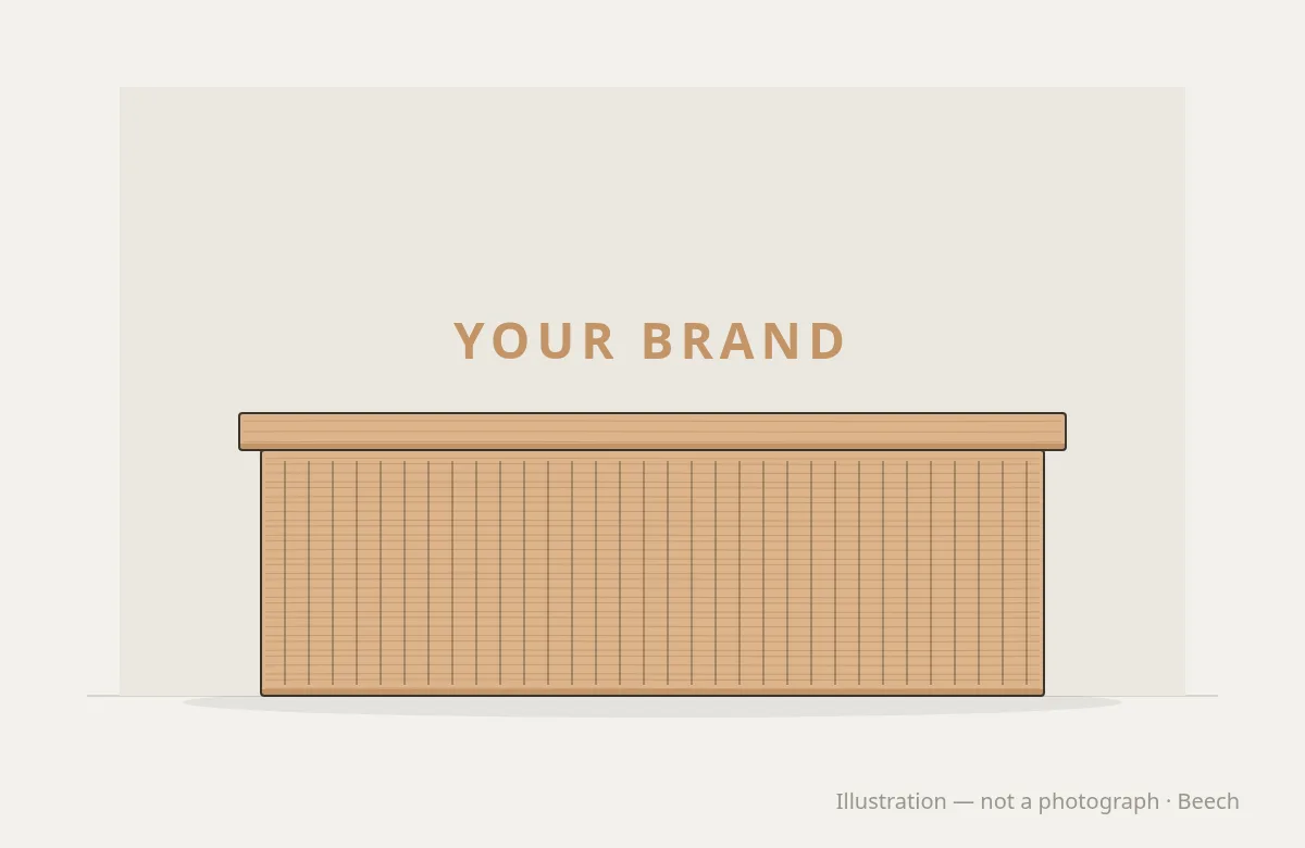
Reception. The desk design, materials, logo position and retail shelving beside it. Reception is the first thing a client sees and the most photographed surface in many studios.
Changing rooms. Locker fronts, benches, vanity units and mirror frames in the same timber and finish.
Details. Edge profiles, corner radii, handle styles and the way metal meets wood. Small details repeated across every piece make the scheme feel deliberate.
Specify colour precisely
Words like “natural oak”, “warm grey” or “brand green” mean different things to different people and different makers. Use recognised references:
- RAL Classic uses four-digit codes, such as RAL 1028, where the first digit indicates the colour family.
- The Natural Colour System describes colour by blackness, chromaticness and hue, in codes such as S 1050-Y90R.
Always approve colours on the actual timber and upholstery, not only on a chart or screen. The same stain looks different on beech, ash and oak.
Specify sheen
Sheen changes how a colour reads. A gloss finish looks darker and richer; a matt finish looks softer. Gloss meters, described in ISO 2813, measure how much light a surface reflects at set angles, and very matt surfaces below about 10 gloss units are usually measured at 85°. Recording a sheen level, rather than a word like “satin”, makes it easier for every batch to match.
Judge colours under the right light
Two materials can match under one light and look different under another. Datacolor, a colour measurement company, explains that this effect, called metamerism, happens because the materials have different spectral reflectance curves, and that colour approval should not rely on one lighting condition alone.
That matters for a brand, because timber, lacquer, upholstery and paint are all different materials. A brand green on the lockers and a brand green on the upholstery may match in daylight and not under the studio’s warm lighting.
- Check approved colours under daylight and under the studio’s own lighting.
- Use the same lighting conditions when checking later batches. In the printing industry, ISO 3664 sets standard viewing conditions for this reason.
- Specify the studio lighting colour temperature as part of the brand standard, so the colours are always seen in the same light.
Keep reference samples
Keep a set of physical samples at head office: timber with finish, upholstery and any painted or stained colours. Store them out of direct light. The Wood Handbook from the US Forest Products Laboratory notes that indoors, visible light causes most colour change in wood. A reference sample kept in the dark stays close to the original, so later batches can be checked against it.
The Handbook also explains that pigments block ultraviolet radiation, so more pigmented finishes generally resist colour change better. If a very consistent colour across sites matters to your brand, a stained or tinted finish may hold its appearance more reliably than a clear one.
Use one manufacturer
Ordering equipment and interiors from one manufacturer is the most reliable way to keep them consistent. One workshop selects timber from the same stock, uses the same finish system and applies the same details to every piece, from a reformer to a reception desk.
Round Fit makes equipment and studio interiors in its own workshop, in beech, ash, oak or any species. Base colours are available alongside any custom colour, so a brand colour can be matched. Every piece is tested before it leaves the workshop.
Write it down
A brand standard for equipment and interiors should include:
- Timber species and finish, with sheen level.
- Colour references for stains, paints and upholstery.
- Upholstery material and performance, such as a Martindale abrasion result under BS EN ISO 12947.
- Logo artwork, positions and methods.
- Drawings of standard pieces.
- Photographs of approved samples.
- A version number and date.
See the Studio Interiors collection and our customisation options. To build a brand standard for your chain, speak to our team.