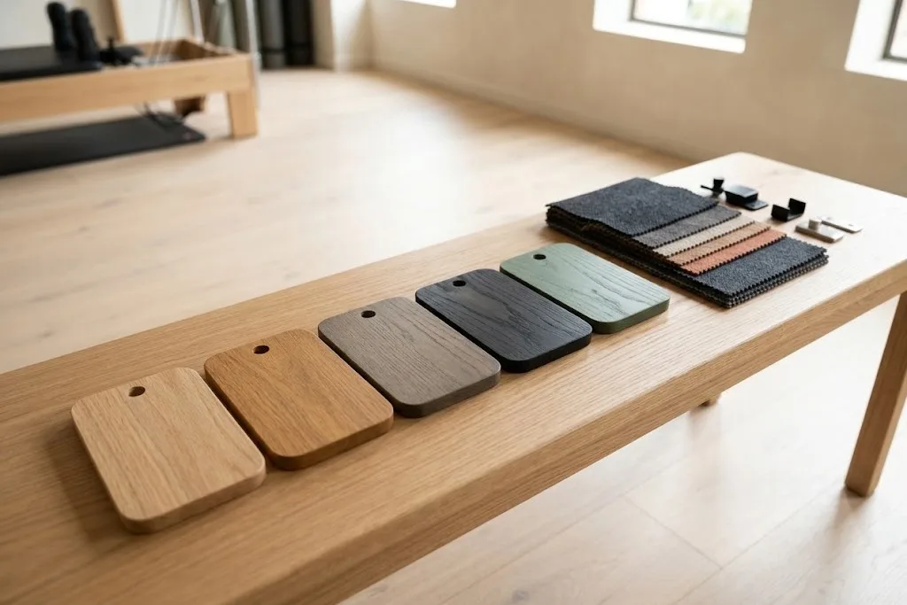
Timber equipment does not have to look like natural wood. A studio brand might be built around a deep green, a soft clay or a graphite grey. A hotel scheme might call for equipment that sits quietly against painted walls. Colour on timber makes that possible while keeping the strength and repairability of solid wood.
This article explains how colour is applied to timber, how to specify it so it can be repeated, and what to consider before choosing.
Three ways to colour timber
There are three broad approaches, and they give quite different results.
Clear finish. The timber’s own colour shows. The Wood Handbook from the US Forest Products Laboratory notes that wood’s colour and grain become more apparent under a clear finish, because the finish fills the wood cells and reduces light scattering. This is the right choice when the timber itself is the feature.
Tinted or stained finish. Colour is added, but the grain still shows through. A tint can warm a pale species, cool a yellow one, or move ash towards the tone of oak. The figure of the wood stays visible.
Opaque colour. A pigmented coating covers the grain. The shape of the piece and the texture of the timber still read, but the colour is uniform. This suits brand colours and schemes where equipment should match painted surfaces.
In each case, a protective lacquer goes over the colour. On Round Fit equipment this is a matt lacquer, which keeps surfaces practical for daily cleaning.
Specifying colour so it can be repeated
“Dark green” means different things to different people. For a single studio, choosing from a physical sample may be enough. For a chain, or for a project that will need repeat orders, colour should be specified by a recognised system.
Two systems are widely used in Europe:
RAL. RAL’s own guidance explains that its collections include 2,540 colours. RAL Classic has 216 colours with four-digit numbers, such as RAL 1028, where the first digit indicates the colour family. RAL Design System Plus has 1,825 colours with seven-digit codes based on hue, lightness and chroma. RAL Classic is common for metal, signage and industrial finishes.
NCS. The Natural Colour System describes colour by how it looks. A code such as S 1050-Y90R gives blackness (10 per cent), chromaticness (50 per cent) and hue (yellow with 90 per cent red). NCS was developed in Sweden and became the Swedish national colour standard. It is common in architecture and interior design.
If your brand guidelines already give an RAL or NCS reference, use it. If they give only a screen or print colour, the maker will need to match it, and you should approve a physical sample.
Why screens and printed charts are not enough
RAL itself notes that printed colour charts are not binding and cannot reproduce every shade accurately, because standard four-colour printing cannot cover the full colour space. Its binding references are physical colour standards produced with varnish systems. The same is true of screens, which vary from one device to the next.
So always approve colour on a physical sample. Ideally, the sample should be:
- The same timber species as the equipment.
- Finished with the same lacquer and sheen.
- Large enough to judge, not a tiny chip.
Timber changes colour, even under colour
Wood is not inert. The Wood Handbook notes that visible light, not only ultraviolet, changes the colour of wood indoors, and that UV stabilisers in a finish do not necessarily prevent this.
With a clear or tinted finish, the timber beneath will drift over time. Pale species tend to warm. Under an opaque colour, the effect is much smaller, because the pigment hides the wood. Tinted finishes sit in between. If you are matching new pieces to existing ones, expect some difference until the new timber has aged.
Choosing colour for a working studio
A colour that looks good on a sample can behave differently in use. Some practical points:
- Look at samples under your own lighting. Studio lighting is often warm and dimmable. A colour chosen under daylight can look quite different at night.
- Consider how marks show. Very dark colours show dust, chalk and scuffs. Very pale colours show grime at hand-contact points. Mid-tones are the most forgiving.
- Think about the floor. A colour that blends with the floor can make equipment look as though it is floating, or it can make it disappear. Some contrast helps people see edges.
- Plan the upholstery and metal together. Colour on timber, upholstery and metalwork should be chosen as one scheme, not one at a time.
- Allow for touch-ups. A recorded colour reference makes repairs and refinishing straightforward.
Colour for chains and franchises
For multi-site operators, colour is part of the brand. Every location should look the same, and replacement parts should match equipment that has been in service for years.
That means:
- Record the colour reference, the species, the finish and the sheen.
- Keep an approved master sample.
- Use the same specification for every order, at every site.
- Check new batches against the master sample before dispatch.
This is covered in more detail on our page for chains and franchises.
Base colours and custom colours
Round Fit offers a set of base colours alongside the natural timber tones, and can match a custom colour on request. Any species and finish are available. Our customisation page shows the options. To agree a palette for your project, get in touch with our team.